Healthy Talbot

Project Details

The Client

Healthy Talbot is a project of the Talbot Family Network built on the belief that healthy communities are made up of healthy families. Their mission is to link families in Talbot County to information and resources that can help them lead healthier, happier lives.

Client Goals

Healthy Talbot was looking to design not just a website but a brand from the ground up. To achieve this, they would need a logo, brand collateral, and a website to serve as their central hub for helpful articles, family-friendly events, and local resources for those in need.

The Result

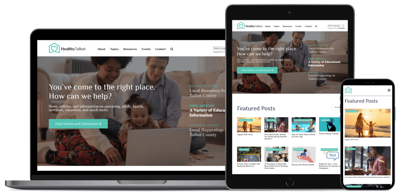
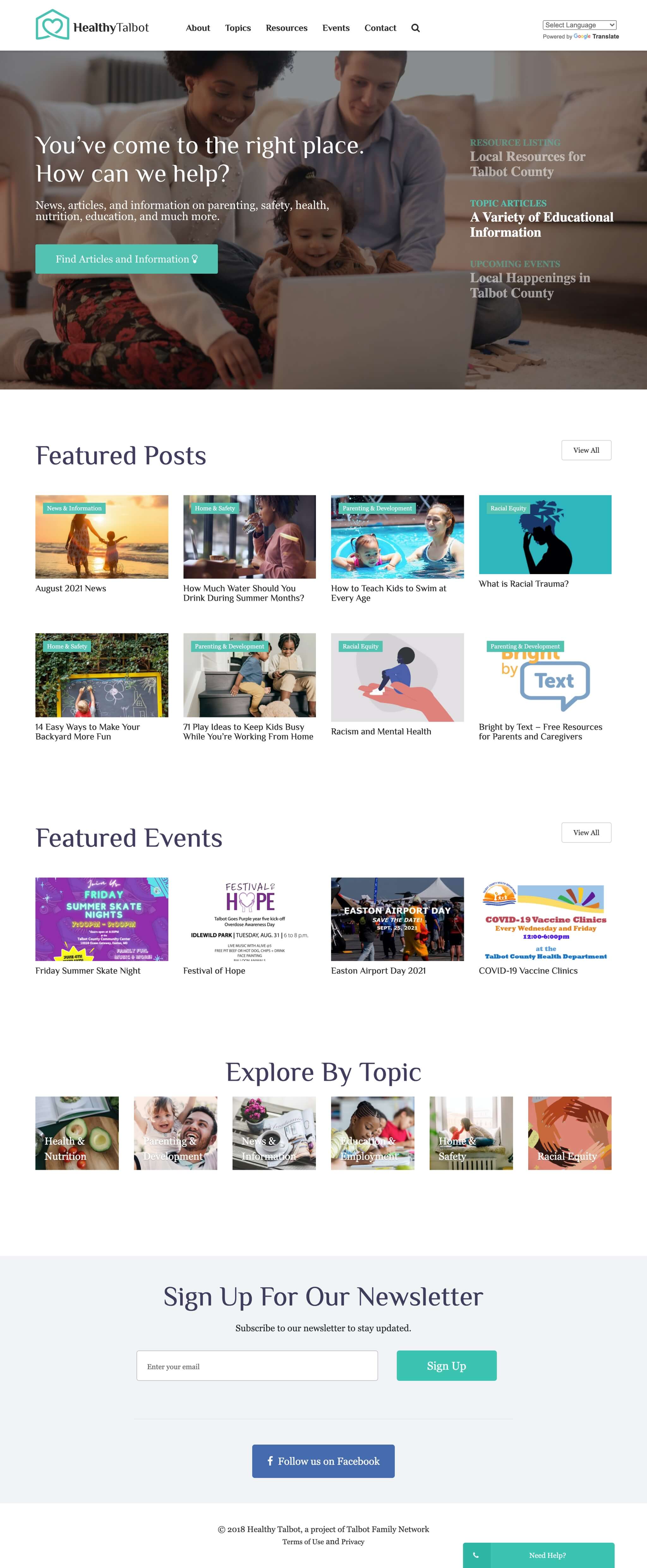
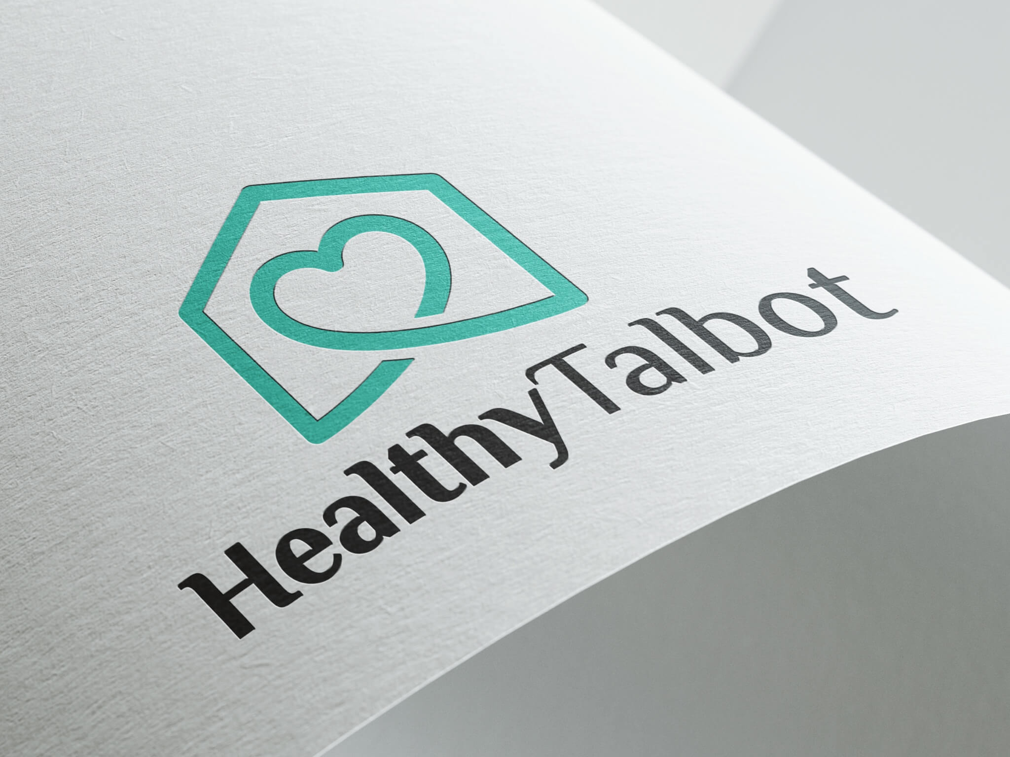
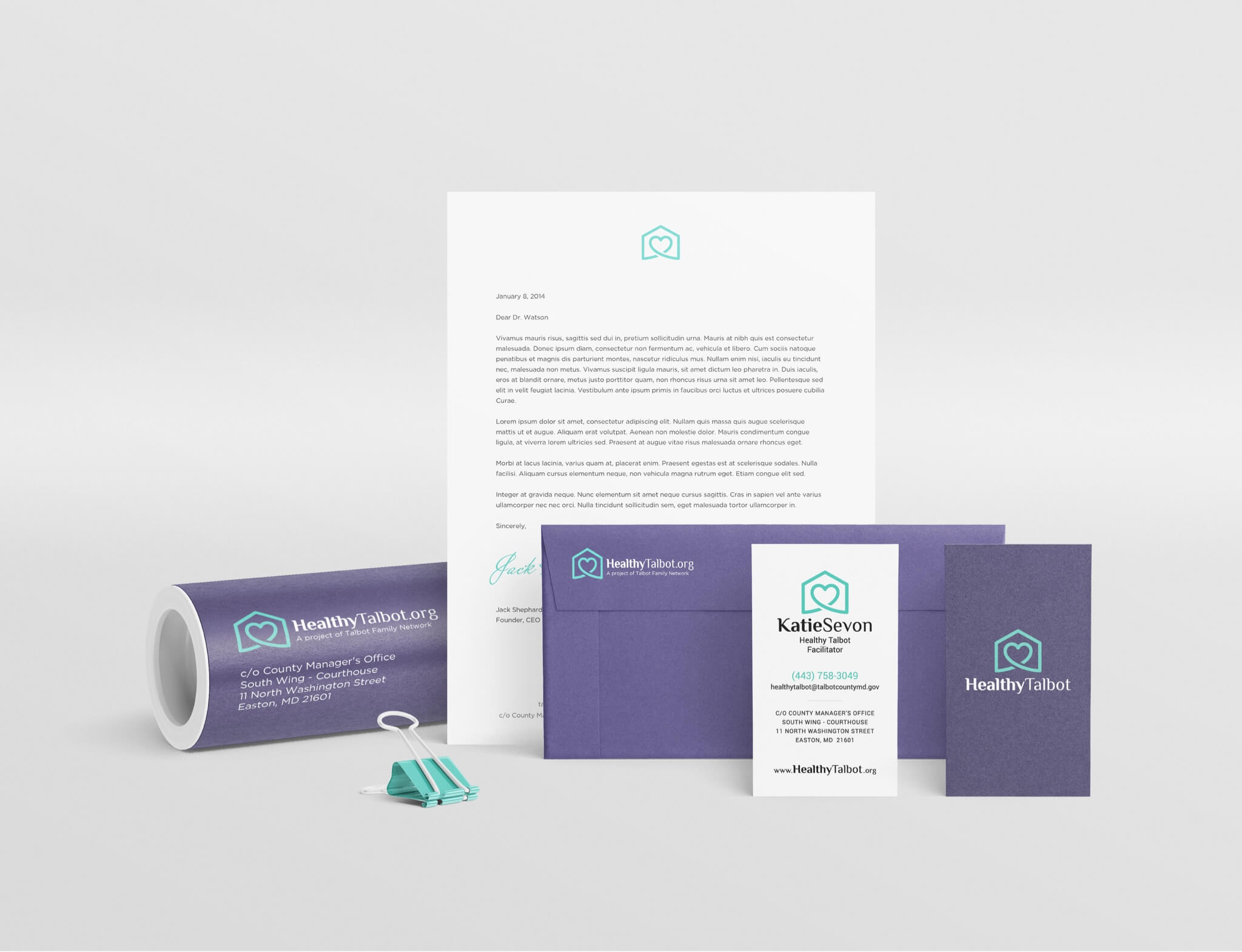
To make this project a success, we needed to establish a logo, print materials, and a website that would all cohesively fit together to form a new brand identity. To achieve this, we worked closely with the client to define their purpose, vision, mission, values, and who they were trying to reach. All of these elements were then baked into every component we created resulting in a cohesive brand and effective resource to help families in Talbot County live healthier, happier lives.

Logo Design & Branding

We started the project by creating the logo that would ultimately become the face of the Healthy Talbot brand. We worked closely with the client to develop a series of concepts, colors, and fonts which we developed over a series of revisions until we landed on the final logo. The final logo blends the imagery of cradling arms representing family with a heart representing health, housed within the classic form of a house to form the final healthy home.

Print Collateral

Once the logo was finalized and all brand elements in place, we began work on print collateral for the project. We developed business cards, letterhead, custom envelopes, and traditional print marketing including stickers, rack cards, signage and more, all featuring the new brand elements. The result is a cohesive brand that effectively stands out both online and off.

Topics

We knew that in order for visitors to quickly and easily find the information they’re looking for, we would need a top-level way of organizing materials. To solve this, we created top-level categories to sort articles by the most popular topics searched on the site. Paired with a feature-rich and intuitive website search tool, this approach has helped to increase the number of visitors who find the information they’re looking for and limit bounce rates.

Blog

Healthy Talbot was looking to include both articles from other sites as well as articles written by their team that would live directly on the new website. Connecting visitors with helpful information was the top goal for these pages. To achieve this, we went with a clean, minimal approach based on readability standards and best practices. The result is a focused, user-friendly layout that caters entirely to the reader.

Resources

One of the print materials that Healthy Talbot produces is a family resource guide that serves as a directory of local resource listings for individuals and families. The client wanted this information to be easily accessed both online and off so we added a dedicated Resources page to the website as well. The Resources page includes the same content as the resource guide while implementing some organizational best practices from the web to create a user-friendly online version accessible from all devices.